← Work / 01 — Brand Style Guide
Netflix Style Guide
A cohesive branding style guide for Netflix — bringing the visual identity, typography, and overall brand expression together into one consistent, usable system.
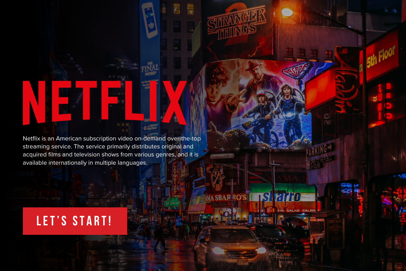
The goal was a single reference that captures how the brand looks, speaks, and behaves — so anyone applying it stays on-brand, from a hero billboard to a small UI label.
Approach
I started from Netflix's core equities — the wordmark, the signature red, and a cinematic, image-led tone — and organised them into clear rules: logo construction and clear-space, a disciplined colour system, a typographic hierarchy, and guidance for how the brand expresses itself across contexts.
The result balances control with flexibility: enough structure to keep applications consistent, with room for the brand's bold, entertainment-first personality to come through.